


Not just by strong expertise, XLAB is also distinguished by strong culture and identity, which is reflected in our brand. The XLAB brand embodies our essence - our people. That’s why we build it together. We do not want it to be an isolated entity built by the leadership and marketing team. Our colleagues are involved in the process, whether through special workshops, surveys, or other appropriate ways. It’s important that everyone feels part of the brand and truly lives it. And at the same time, our brand communicates to our partners and clients who we are and what they can expect from working with us. That’s why the XLAB brand has a special meaning for us.
Professionalism with a dash of playfulness
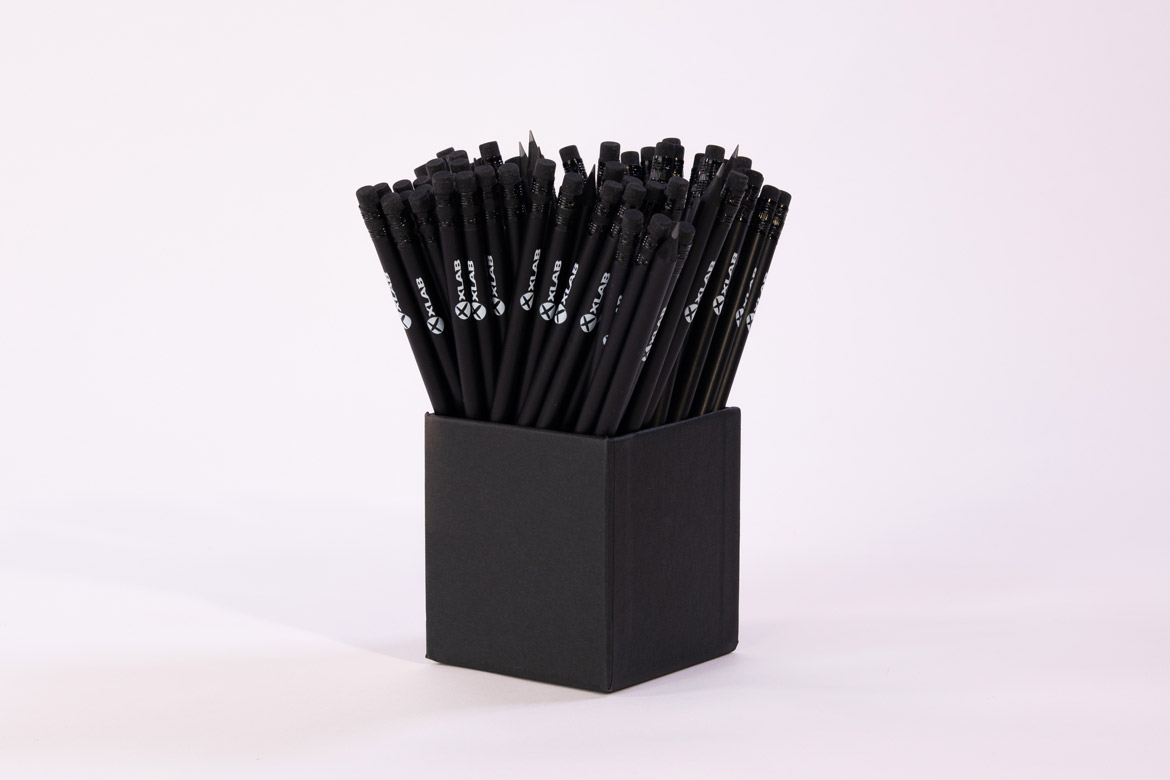
The XLAB brand stands for innovation, excellence, and professionalism, but it also exudes playfulness which we are known for. This distinct duality guides our design. Corporate materials are minimalistic and clean-cut, while fun brand materials are, in contrast, adorned with illustrated details.
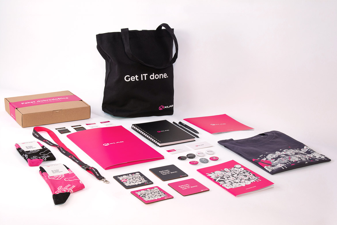
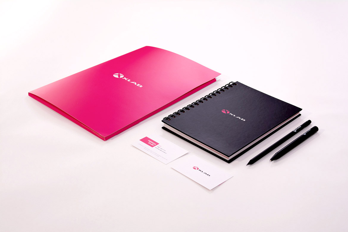
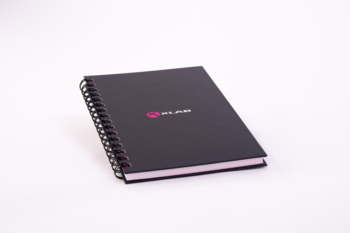
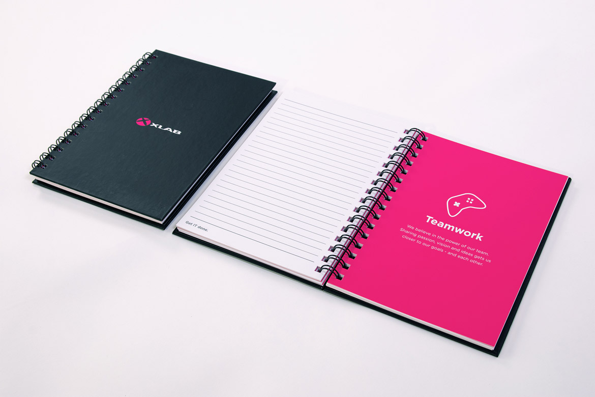
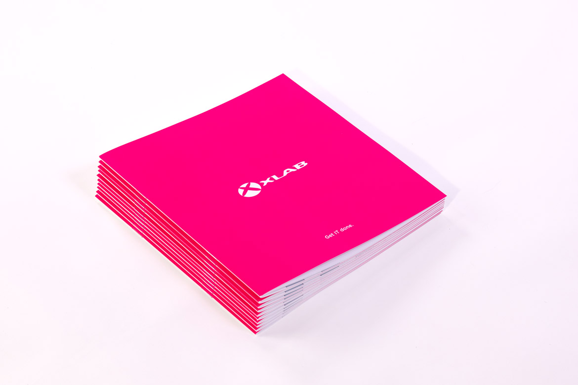
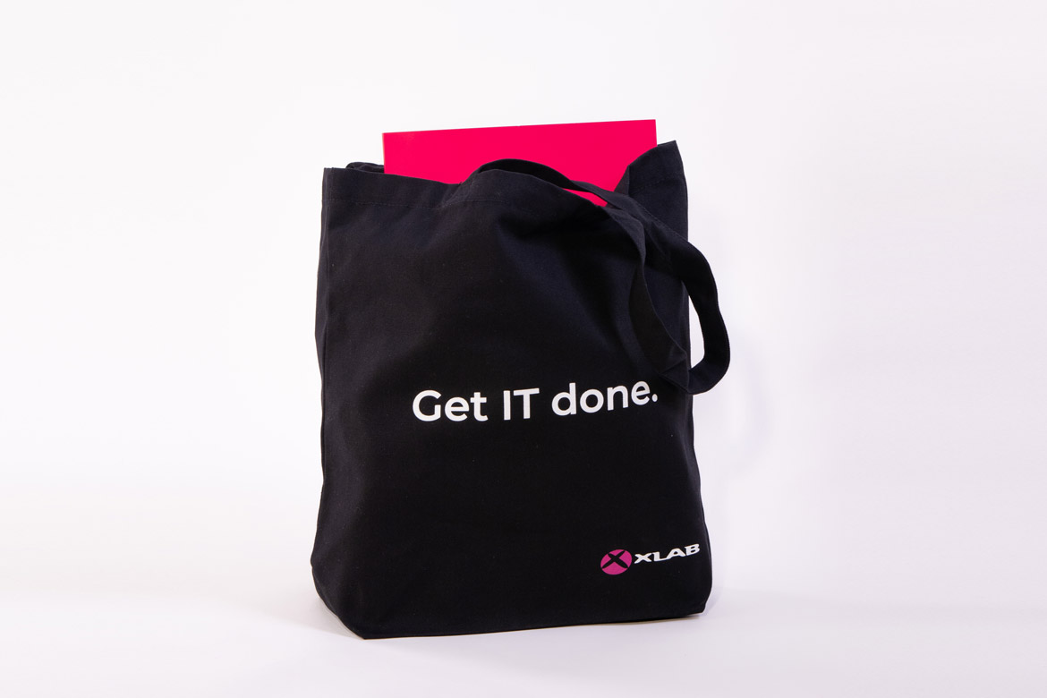
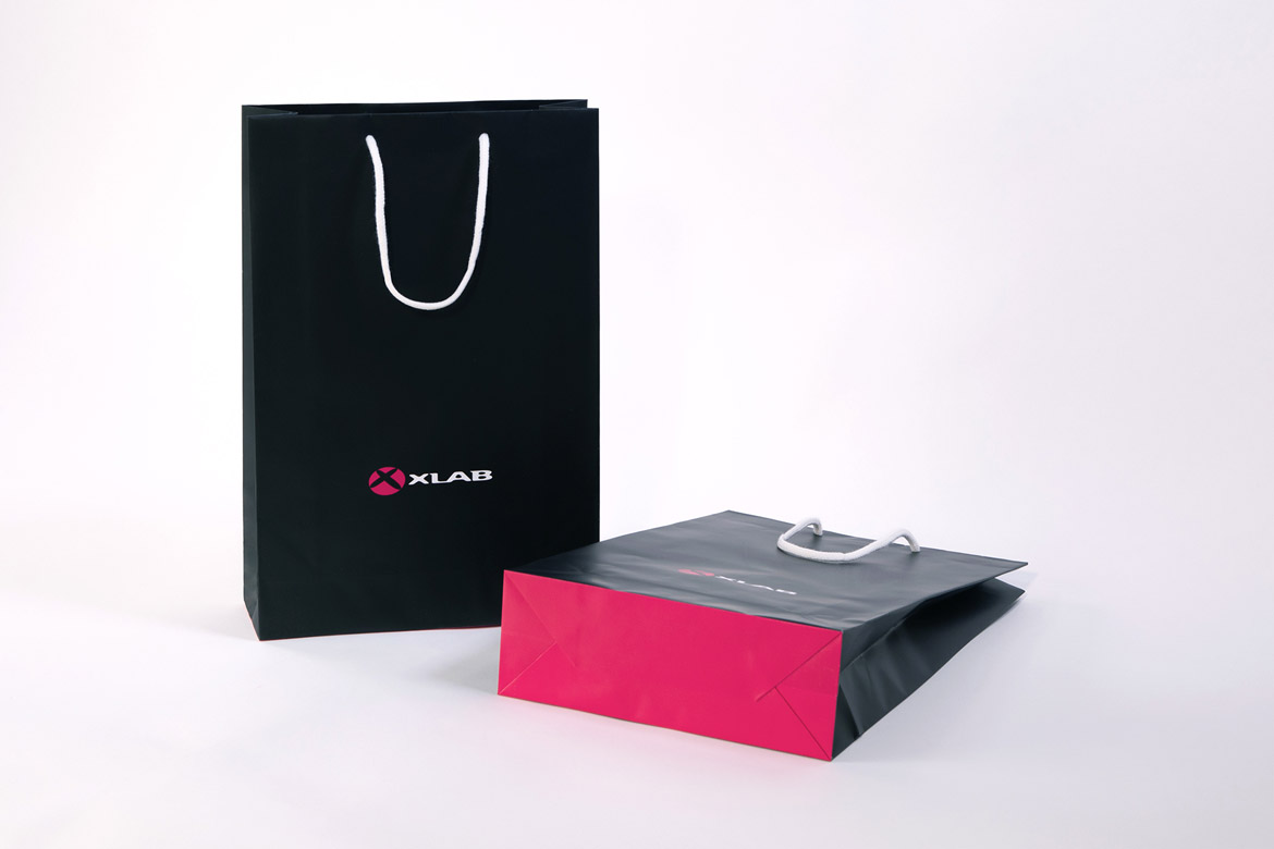
XLAB’s stationery - business cards, notebooks, and brochures - has a clean, simple, and powerful layout featuring only the logo on a magenta, black or white background, the company’s color palette. Combined with the slogan “Get IT done.”, it inspires action, both on a professional and very personal level.
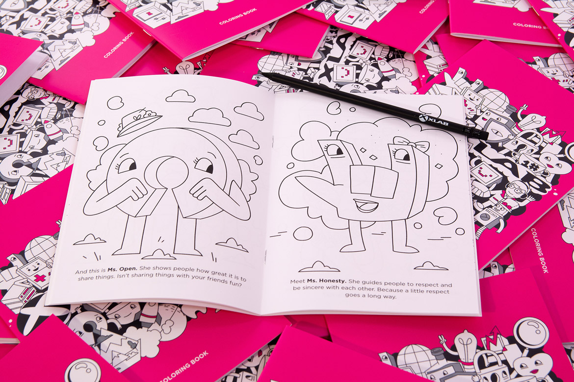
The relaxed design of promotional materials is the exact opposite. A great example of this contrast is the motif for XLABs 2021 t-shirt and other goodies. As we celebrate our 20th anniversary, we created a special line of brand materials under the slogan Every piece counts. Because to build something great, a lot of pieces have to fall together. And every little piece counts. Since a company is not just its products, but the sum of all its parts - including people, culture, and values - these are portrayed as personified characters to add playfulness to the expertise the company is known for.
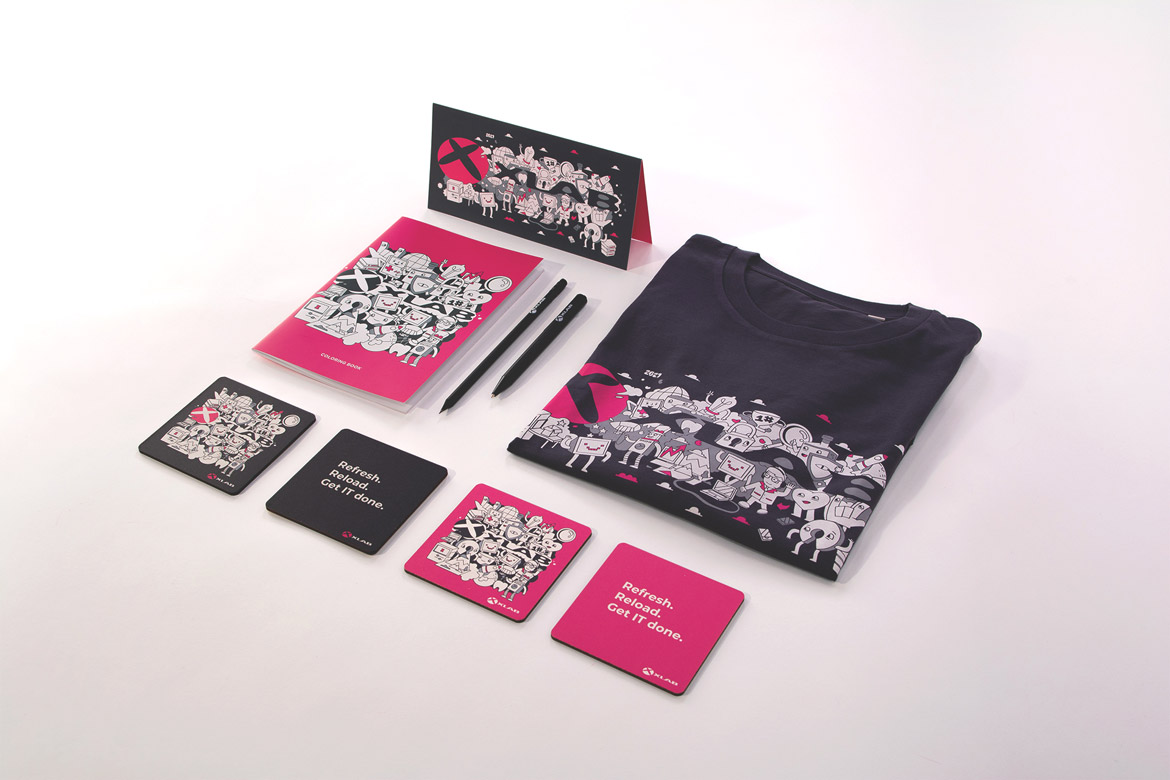
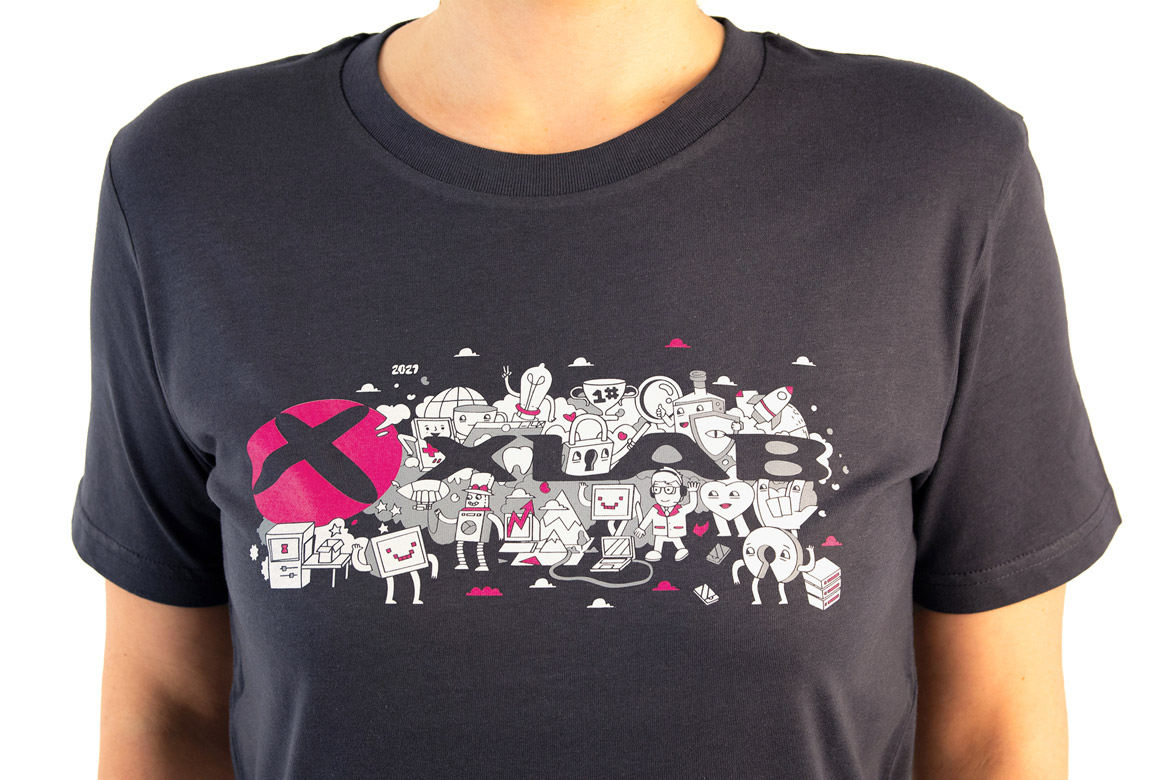
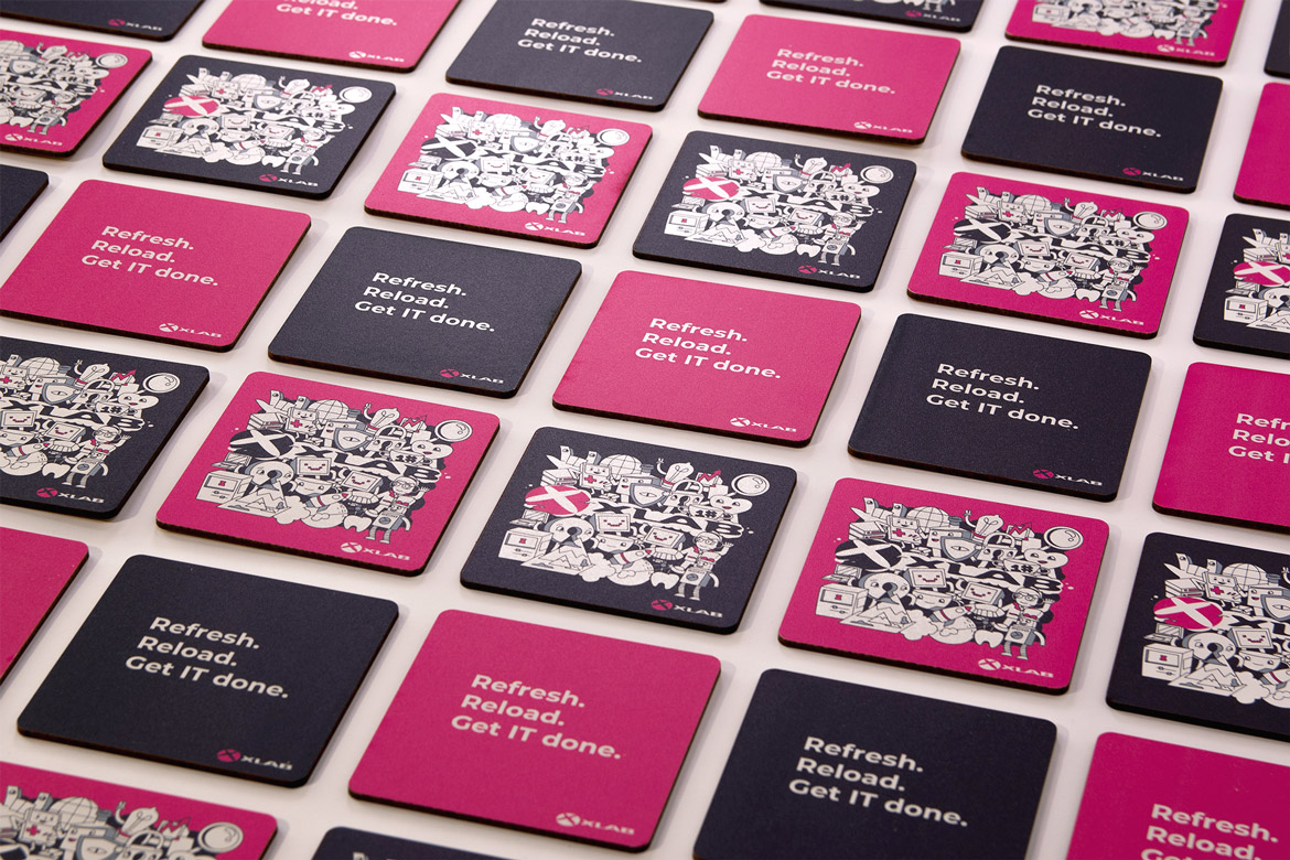
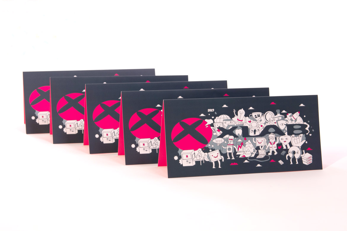
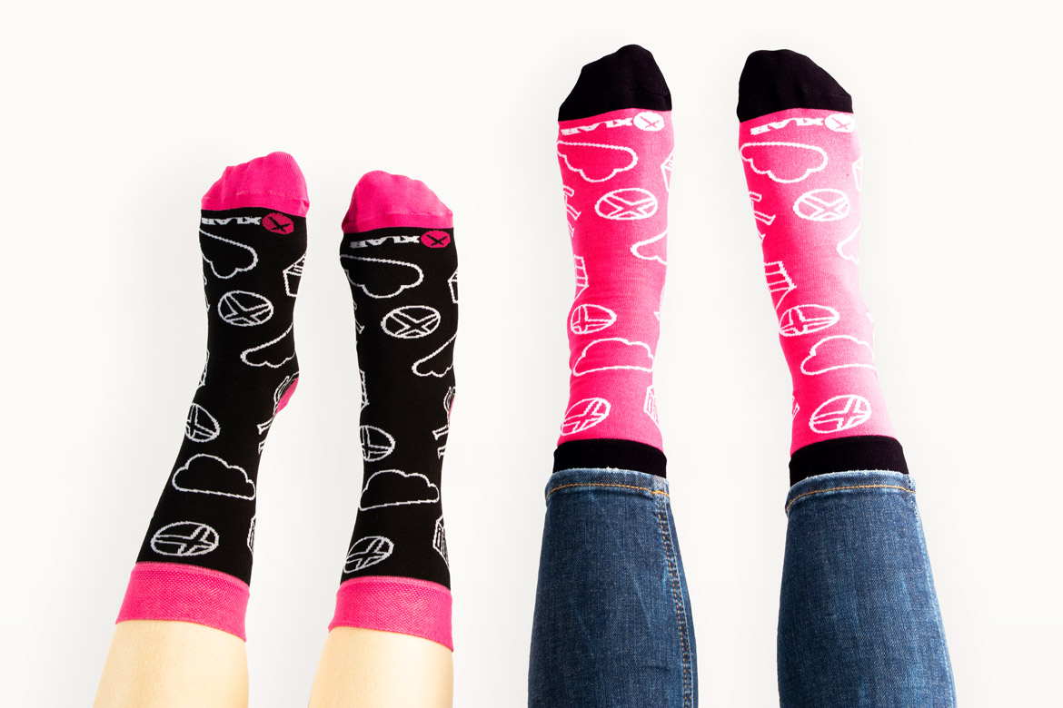
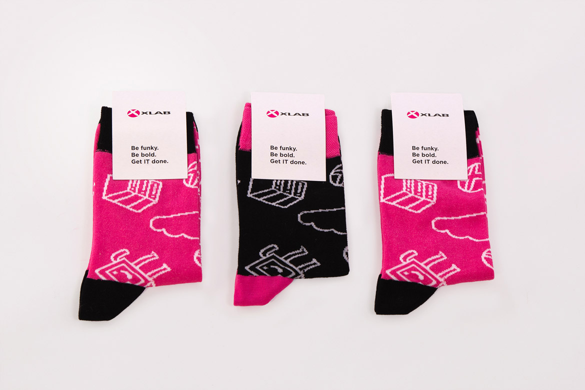
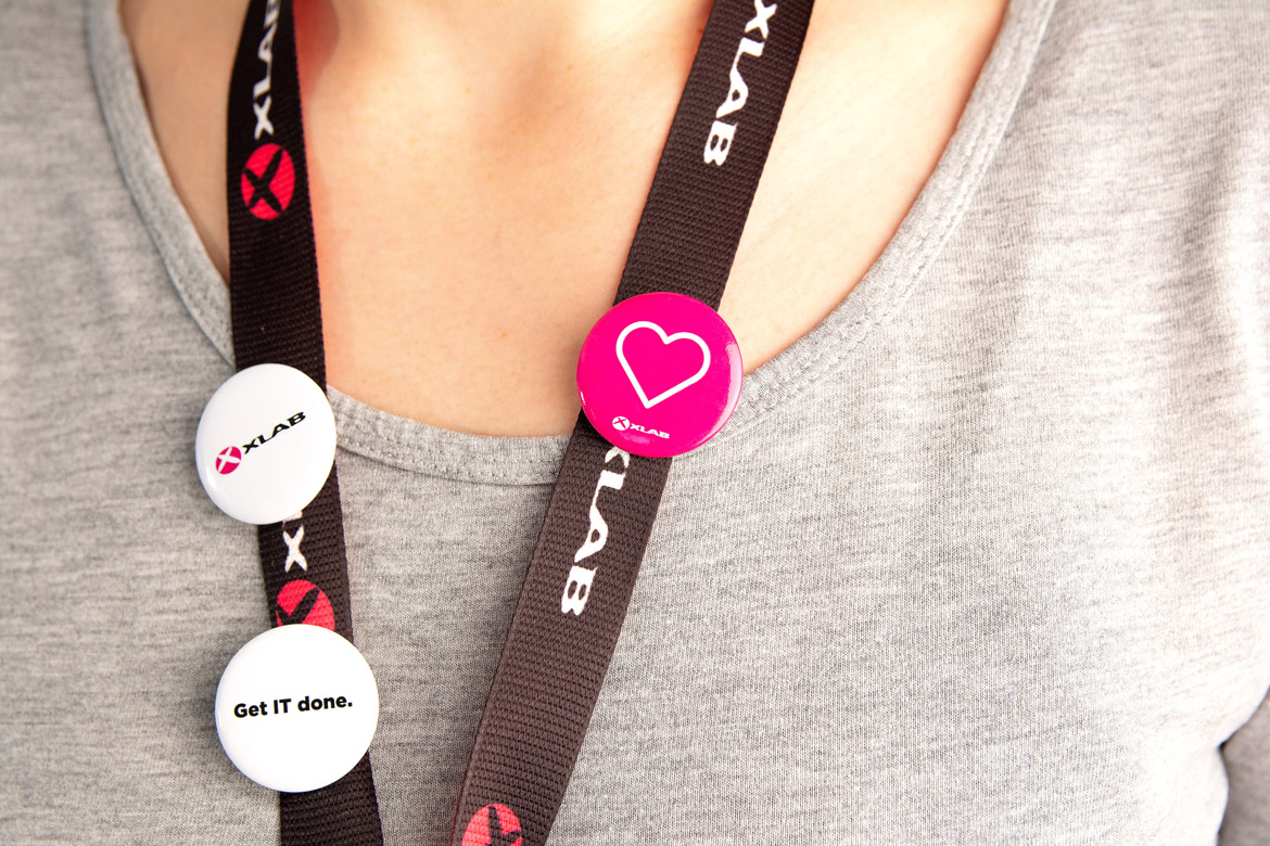
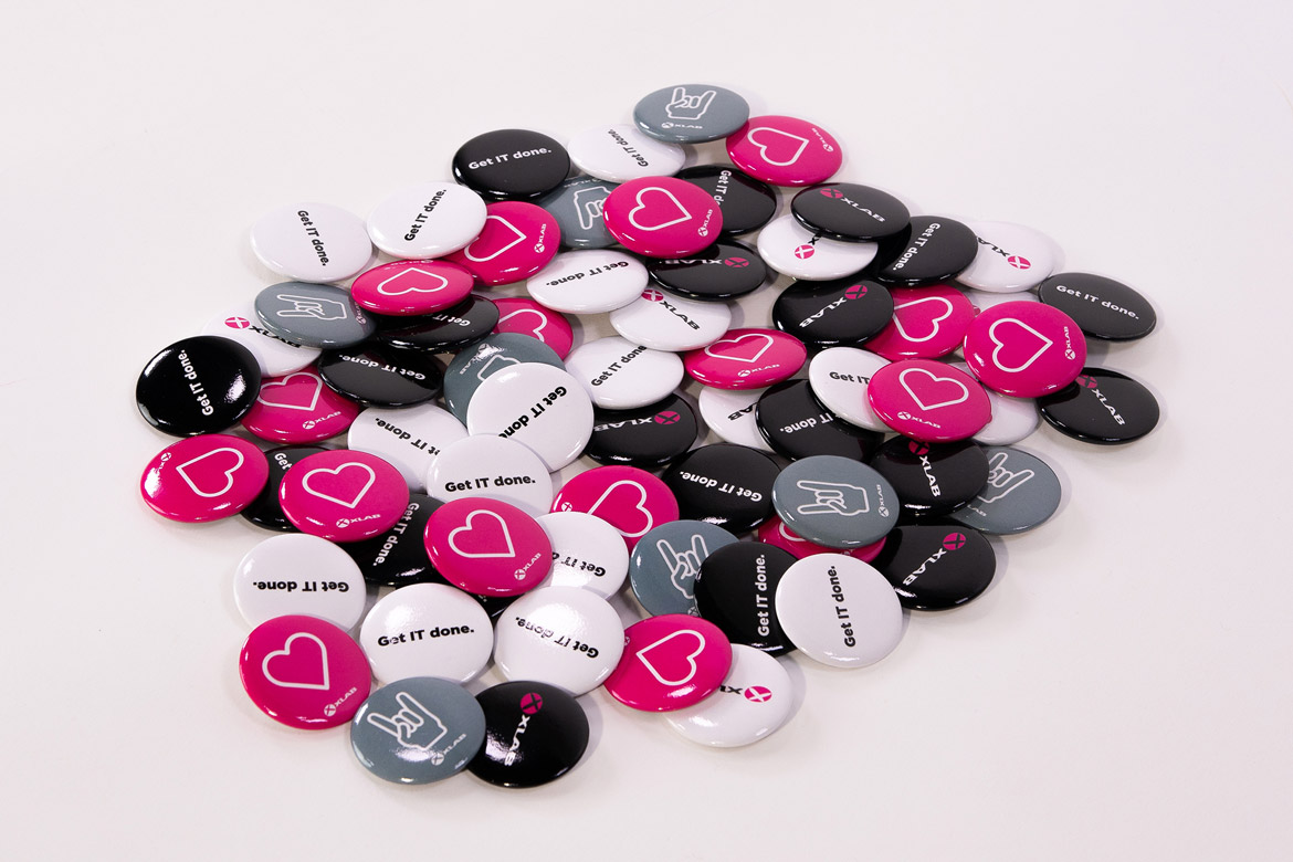
What ties all the materials together and provides consistency is XLAB’s logo and color magenta. Strong, bold and fun, it draws attention and sets XLAB apart from other IT companies. The duality of the materials radiates the image of a technological, yet people-focused company.
“Creating the XLAB story begins and ends with our people. We love seeing our colleagues get excited about new t-shirt designs, new stickers, pens … Our goal is that all XLABers enjoy wearing and using our materials, that these materials connect them to each other and to the company, and that they proudly share our story with the outside world - with business partners, future coworkers, their friends …’’, explains our lead designer Anja Vidmar.
“When people are excited about the brand, this enthusiasm has a ripple effect. That’s why design is not just something nice to look at. It represents what the company stands for, what it believes in and what it promises to business partners and clients. It is an essential part of business success because the personality of the company is expressed through the brand materials,” she concludes.


